Why
CCC is one of the biggest Polish footwear and fashion companies.
How big, you might ask? 1 in 5 Poles is a CCC Club member.
The CCC Club is more than just a loyalty program. It’s a multi-channel system, featuring:
- A rewards program linked to customer spending
- Physical membership cards
- Brick-and-mortar stores
- Discounts from CCC Club partners, and many more features
Having existed for over 10 years now, CCC Club has been facing numerous challenges, including:
- Tech debt
- Design legacy
- Outdated brand perception (CCC has gone through a major rebranding recently)
- Moving CCC Club cards from physical to digital formats
View the CCC Club landing page(in polish)
What
As a member of the Experience Design Team, I was responsible for assessing the current state of UX in the product and coming up with possible strategies to implement.
Project objectives
- Identify and address major client pain points throughout the Customer Journey.
- Define and prioritize short-term and long-term improvement opportunities.
- Design ready-to-implement solutions.
How
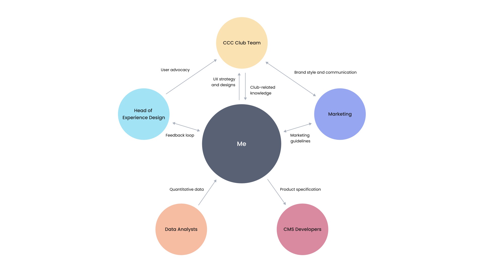
The project was based on cross-team collaboration. I started by bringing together the CCC Club team, marketing specialists, data analysts, and software developers.
During the kick-off workshop I facilitated, we aimed to understand the core of the CCC Club: user profiles, product data, user interactions, common issues, and user journeys. Apart from these new findings, we also worked with previous UX research insights.
Key tasks
- Conducting a thorough user journey audit
- Gathering and analyzing both qualitative and quantitative data
- Identifying quick wins for immediate UX improvement
- Developing a UX strategy and a corresponding development roadmap
- Creating designs aligned with the product roadmap
Main challenge
CCC Club has been around for over a decade now. During that time, the UX standards and user expectations have evolved. The CCC Club was doing well business-wise. To keep it that way, we need to adapt it to the current state of things.
Deliverables
Main outcomes
- An in-depth report with actionable recommendations for improving the user experience, with business value in mind
- Close-knit collaboration between teams, closer than ever before (thanks to a series of workshops I conducted)
- Setting up short-term and long-term UX strategies for the CCC Club
UX strategy
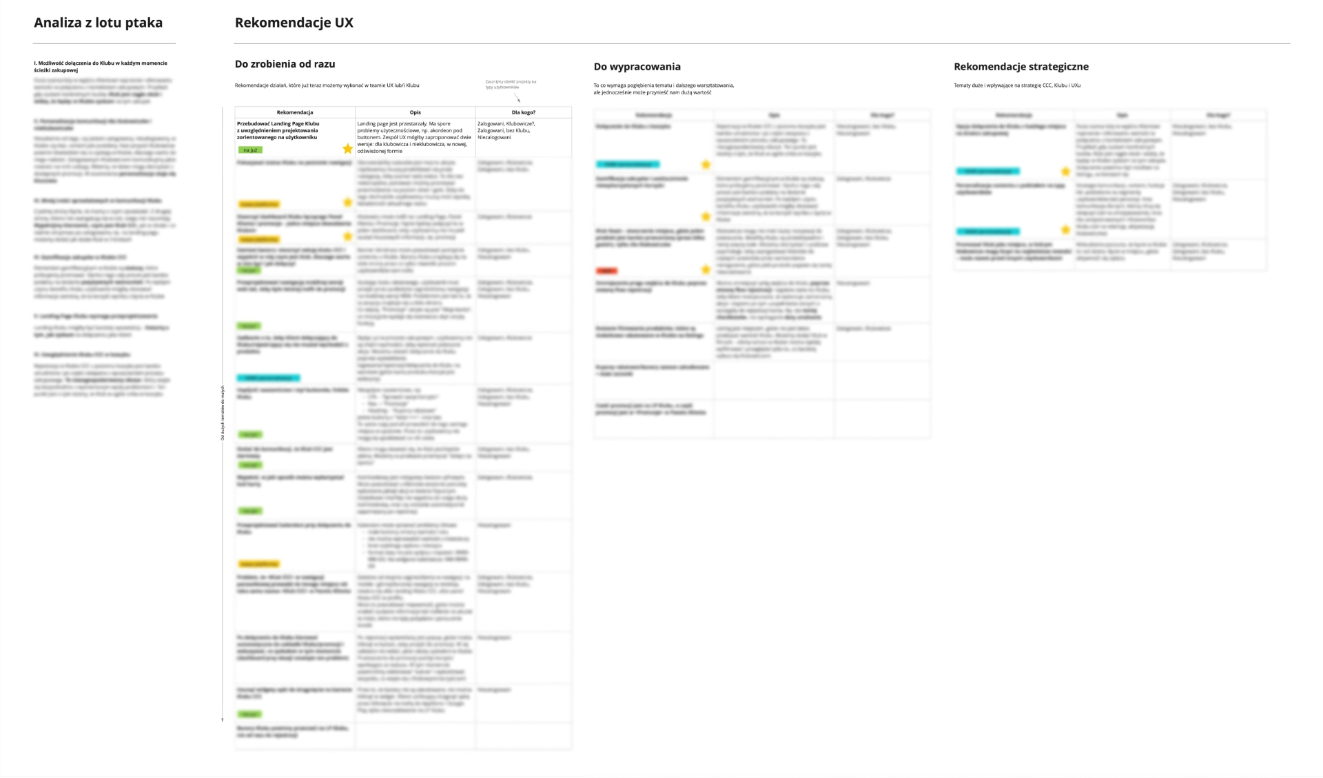
An in-depth UX strategy, outlining the current state and future development plans.
UX audit
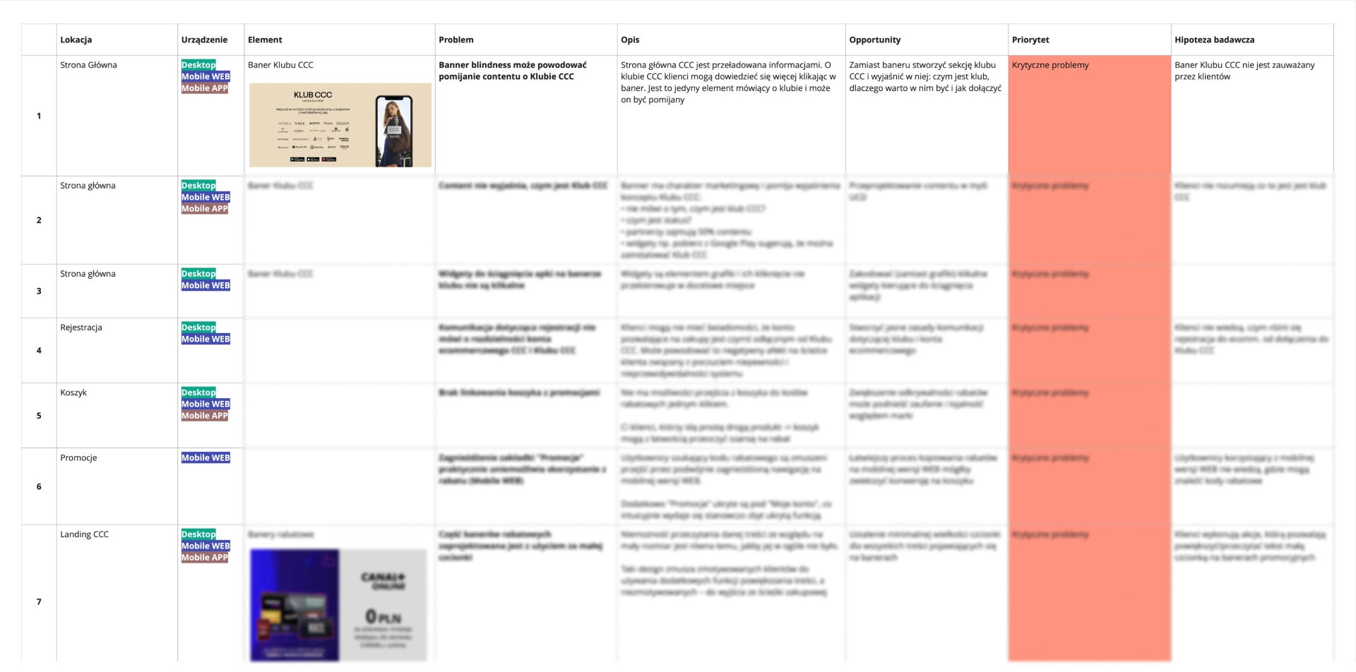
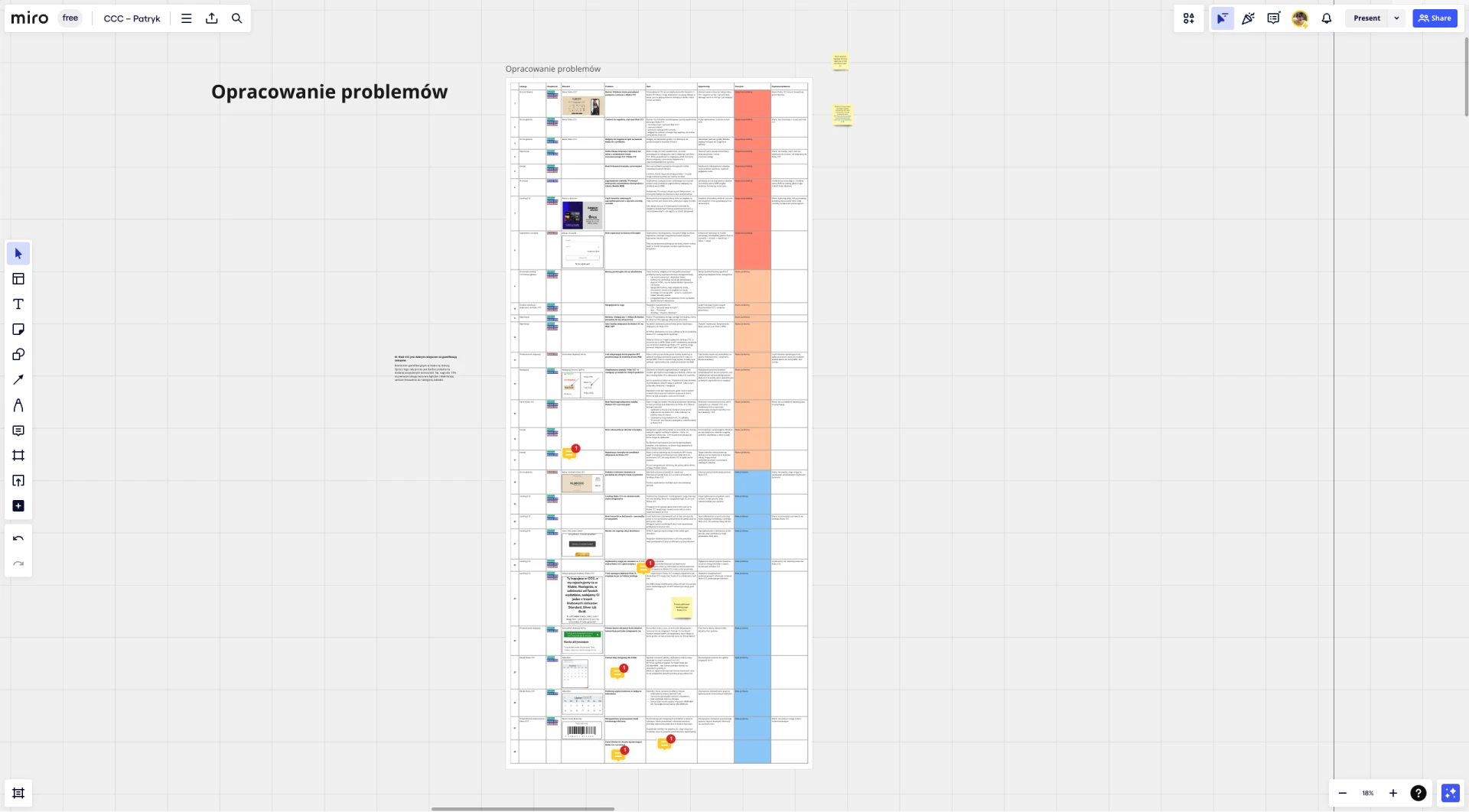
A detailed UX audit, identifying over 30 issues and proposed solutions.
Development roadmap
A Jira roadmap based on the UX audit and strategy findings.
(visuals unavailable, sorry!)
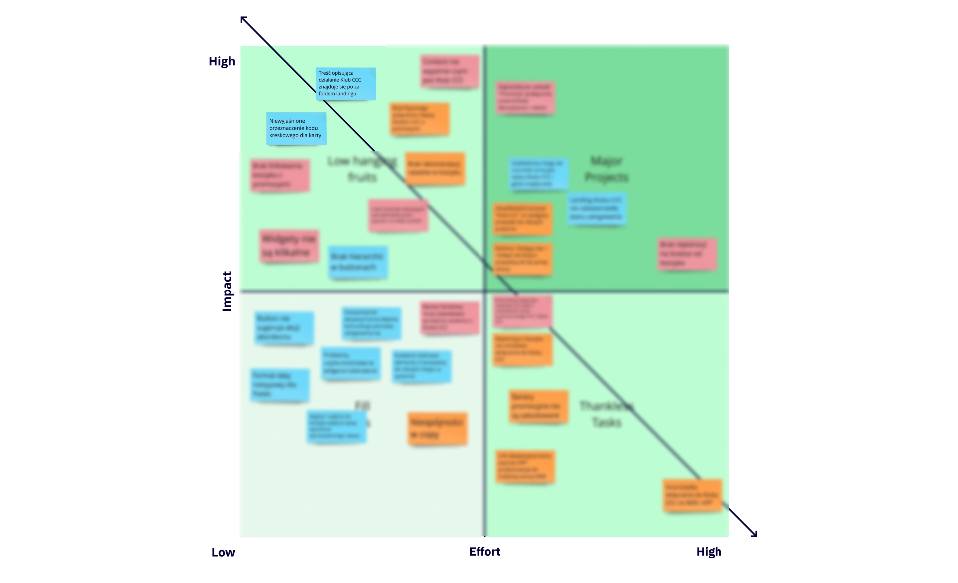
Low hanging fruit
Identified over 10 high-impact, low-effort initiatives using the Eisenhower Matrix.
Selected designs
Based on these deliverables, I designed solutions for opportunities identified in the CCC Club UX strategy. Due to my NDA, I can only provide brief descriptions and overviews of 3 major projects:
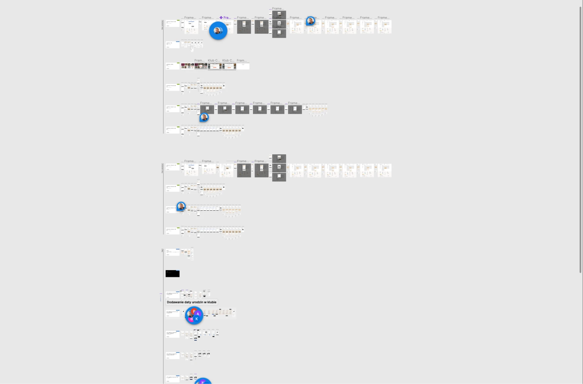
1. CCC and HalfPrice sign-up flow
Challenge: HalfPrice is an off-price store and a part of the CCC Group. Until now, the sign-up and the Club experience were separated.
This project was particularly challenging, as it required cross-platform designs, including the CCC app, CCC website (mobile and desktop), and the HalfPrice website.
Solution: Considering the shared user base between CCC and HalfPrice, I redesigned the sign-up flow for both brands. The designs were later refined using the Rapid Iterative Testing and Evaluation (RITE) method with CCC Club members and prospects.
2. New CCC Club landing page
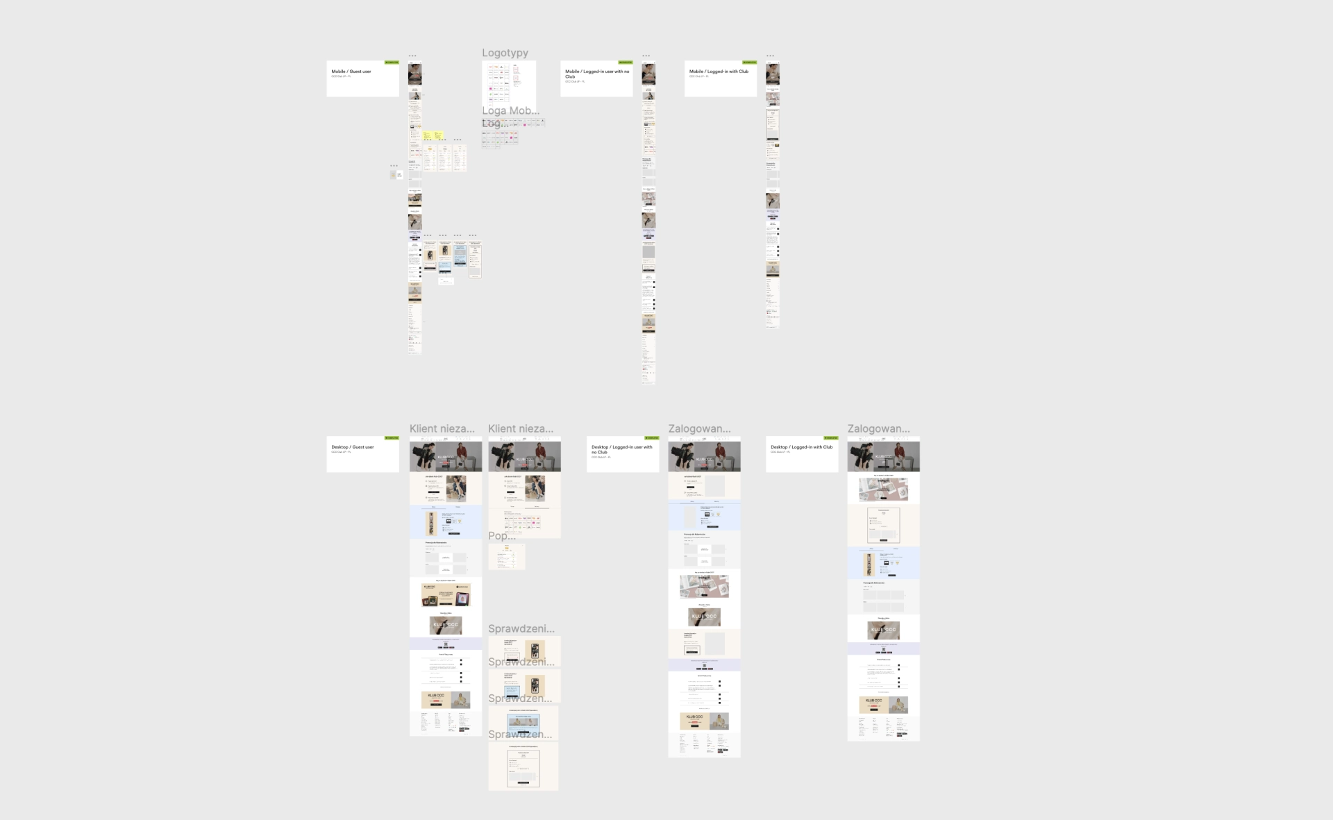
The existing CCC Club landing page was already getting a lot of traffic from various sources (e.g. ads and press releases), and yet, it left a lot to be desired. We decided to redesign it, with a special focus on the following goals:
- Help new visitors understand how the Club works
- Display available vouchers (value proposition)
- Allow physical card users to easily check their Club Status (reward program level)
- Increase conversion (the number of new sign-ups)
Check out the prototype and see it in action:
3. CCC Club dashboard
The CCC Club logic is complex, to say the least. Users have a hard time figuring it out, and it turned out to be a significant pain point we discovered along the way.
A good place to start was the CCC Club dashboard. It’s a hub where Club members can learn about their rewards, track their purchases and earned points, as well as get more information about the Club.
Main challenge: Club members don’t know their current Club status. They don’t understand the benefits coming with a higher status.
Objective: Increase discoverability and usage of the Club status feature.
Proposed solution: To make sure users understand the relationship between their purchases and CCC Club points, I combined Club dashboard within orders list.
Instead of an orders list, the users now see an entire activity log. In there, they don’t only get notified about updates on their order but also all things related to the CCC Club (e.g. reaching a new level or unlocking a new reward)
Check out the design concept:
The process
1. Define objectives
Together with the Head of User Experience, we defined the goals and the timeline for this project.
Challenge: The CCC Club never had a dedicated UX professional. Throughout the years, this led to many inconsistencies and usability debt.
Solution: Define how the UX Team can reduce usability debt and create a UX Strategy based on our findings.
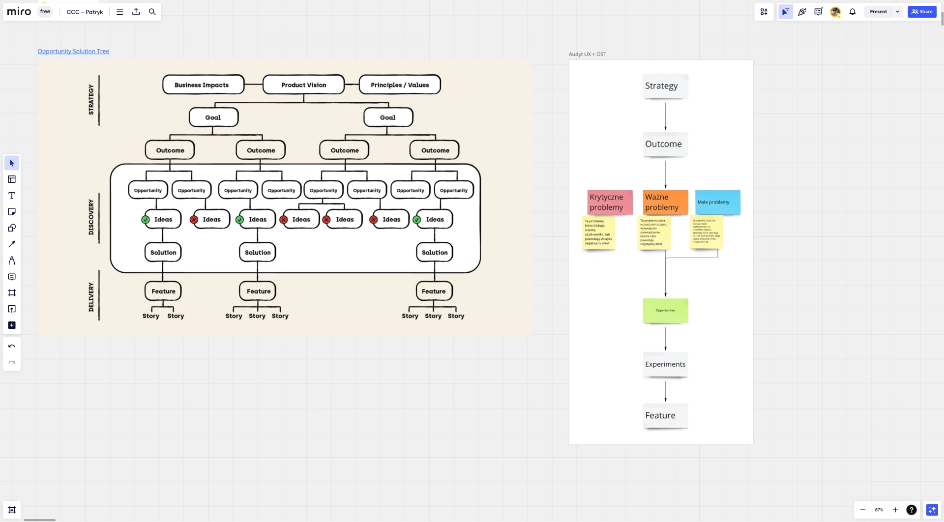
Method: To reach this goal, we agreed on using multiple methods, including the Opportunity Solution Tree. The idea was to align our UX team goals with high-level goals of the organization. We used OST later in the process, during workshops (more on that later).
2. Desk research
Challenge: Over the years, the company already gathered plenty of data on our target group, including:
- User studies
- Quantitative data
- Session recordings (HotJar)
The challenge was to make this data actionable for decision-making.
Solution and method: Based on these sources, I built a knowledge base to support my design decisions. I focused on:
- Pain points on the customer journey
- Core metrics, e.g. traffic, segments, conversion, etc.
- Benchmarking using the Baymard Institute eCommerce research base.
- Setting up main KPIs to measure the outcomes of our work
3. UX audit
Challenge: Find opportunities for improvement and define areas that need more research.
Solution: Conduct a UX Audit.
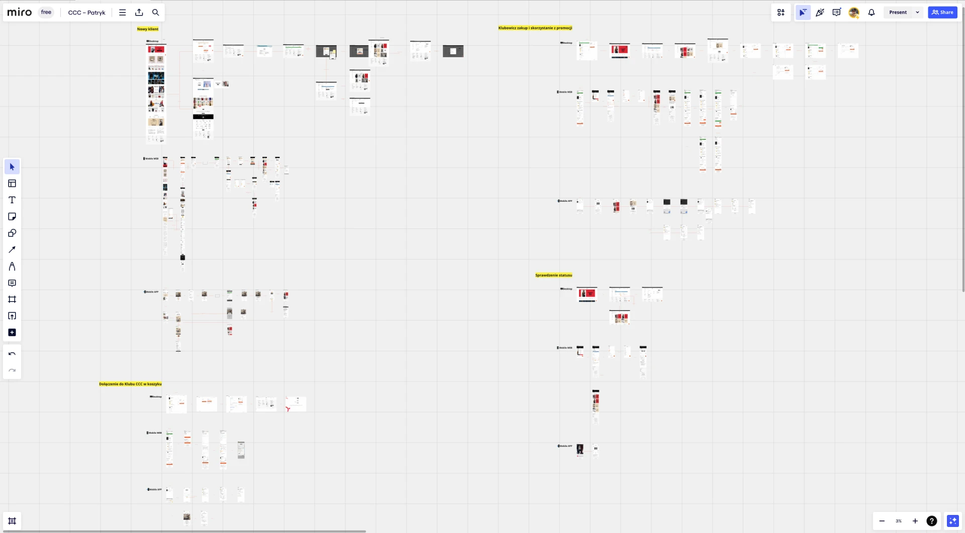
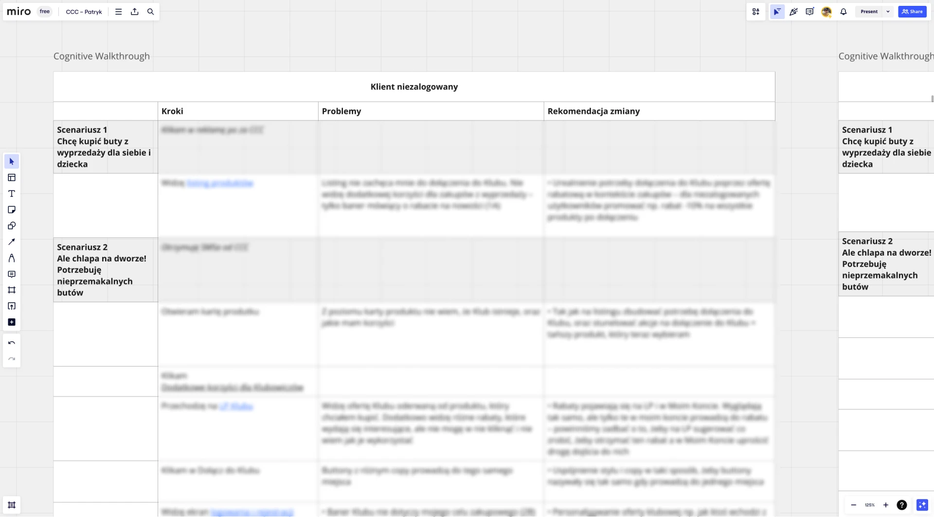
Method: I used the cognitive walkthrough method and focused on digital touchpoints only (as this is the part we could impact most as the UX team). The process included:
- Writing cognitive walkthrough scenarios
- Going through each step of the user flow, taking screenshots and collecting them in Miro
- Using sticky notes, adding comments and questions to every detail that needed more attention
- Refinement with the User Experience Lead to make sure the project is headed in the right direction
5. Series of workshops
Challenge: Communicate the findings across different teams and decide on next steps together.
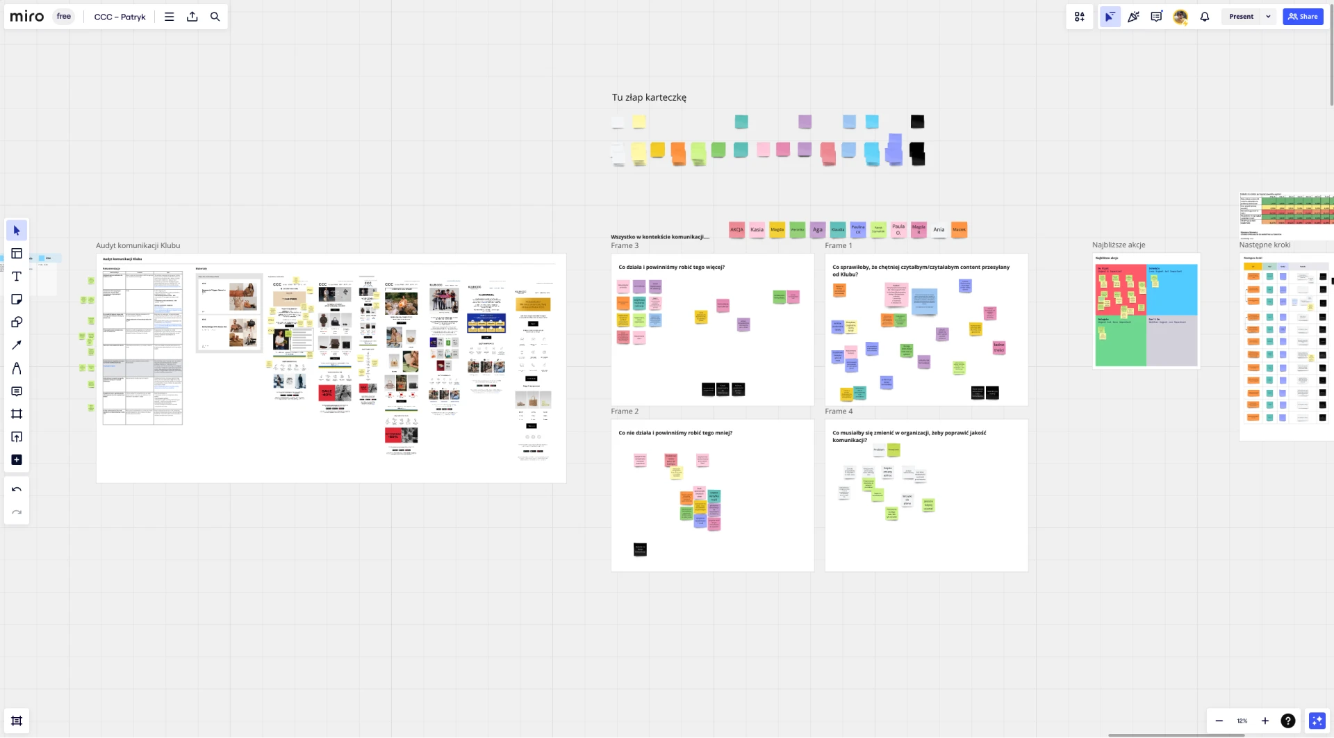
Solution and method: This stage started with a short summary presentation. The presentation was then followed by a series of workshops I facilitated. Together we have digged deeper into the work that needs to be done. This was not limited to the UX Team only. For instance, I sat together with the Marketing Communication Team to improve the way we communicate with our clients.
6. UX strategy and audit report
Challenge: Effectively reach decision-makers to communicate what we can do to improve the user experience.
Solution and method: After the workshops, I summarized all the findings using two documents, focused on opportunities and solutions.
(See more in Deliverables)
7. Low hanging fruits
Challenge: A product with more than 10 years of legacy is difficult to change right away. From the start, we knew we’re in it for the long run. But where do we start?
Solution: One of the defined goals was to find quick wins for the company. We looked for changed that can be implemented right away with the help of our CMS developers.
Method: Using the Eisenhower Matrix, I conducted a workshop with peers and stakeholders to find ideas with high impact and low effort.
(See more in Deliverables)
8. Roadmap
Challenge: Fit all the proposed changes within the long-term product roadmap.
Solution and method: Together with UX Manager, we prepared a development roadmap for the CCC Club. We also introduced epics to measure progress and define workload for our team. In the first months, I was co-responsible for these tasks.
9. Designing
Challenge: Create solutions ready to be used by our clients.
Solution and method: Every solution I designed was a separate project. In this case study, I am briefly describing 3 of the 8 major projects I worked on.
(See more in Deliverables)
Conclusion
Final steps: The strategy, the roadmap, and the designs were delivered to CCC Club Team. The team is now in charge of all further design decisions, both long-term and low hanging fruit.
Areas for improvement: At one point, the UX team focused on mostly on designing, and not as much on the new UX strategy. Because of that, we stirred away from the long-term vision.
Looking back, I see we could also include business and data analysts earlier in the process, to set up long-term metrics that would help us validate our work. Even despite that, we reached our main goal at the time: agile and fast design process.